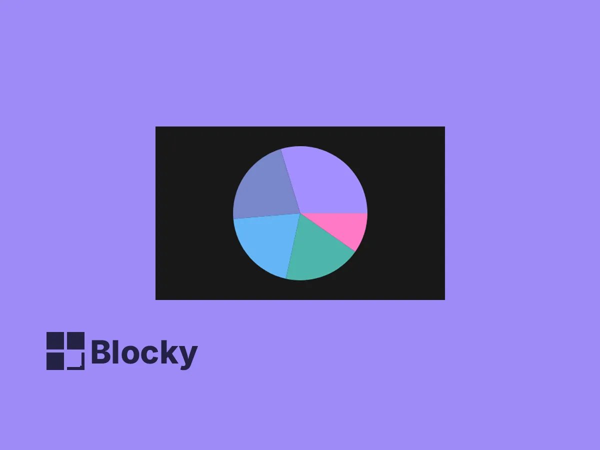
Pie Chart
A classic pie chart to visualize parts of a whole — great for showing breakdowns, categories, and progress in Notion.
Donut Pie Chart
A sleek donut-style pie chart that offers a modern twist — ideal for dashboards that balance visual clarity with style.

Use Cases
Category Breakdown
Visualize how tasks, time, or budgets are split between categories.
Survey Results
Summarize responses and proportions from form submissions or user polls.
Goal Completion
Track what percentage of a goal has been completed versus what remains.
Donut Mode
Inner Radius Toggle
Enable donut-style chart for sleek circular insights.
Label & Legend Options
Flexible Display
Toggle labels or legends to fit your Notion layout perfectly.
Clean Presentation
Minimalist Layout
Pie charts maintain clean formatting and intuitive visual feedback.
Settings
| Setting Name | Section | Type |
|---|---|---|
| Add Label | General | toggle |
| Show Legend | General | toggle |
| Make Donut | Donut | toggle |
| Inner Radius | Donut | slider |
Slice Data Visually in Notion
Use embedded pie charts to quickly showcase how your categories compare.