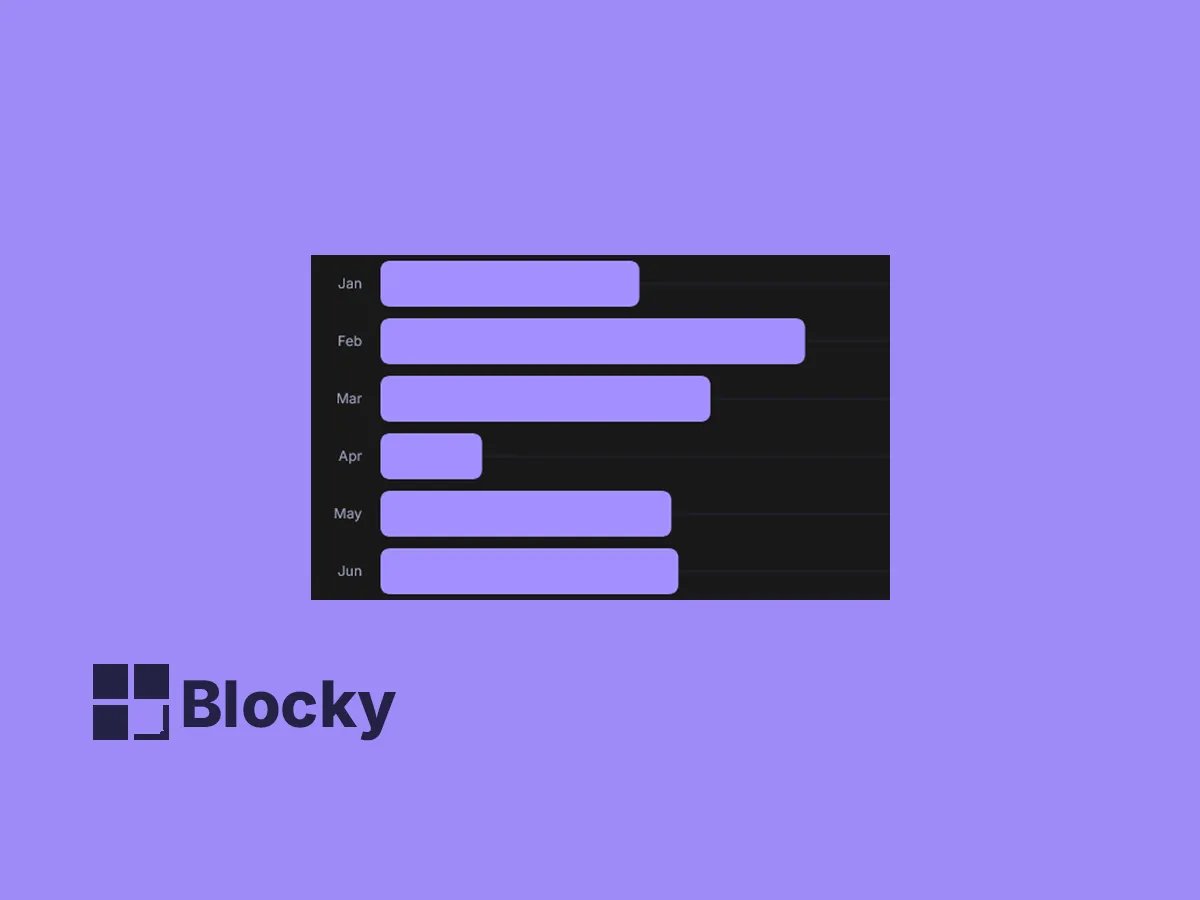
Horizontal Bar Chart
Ideal for comparing long labels or ranked data, this horizontal chart keeps your layout clean and readable.
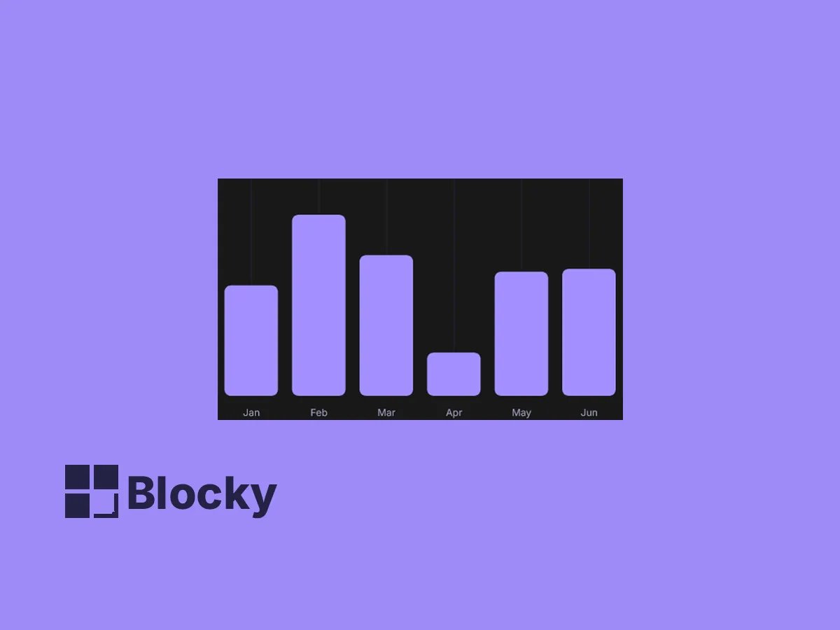
Vertical Bar Chart
Classic column-style chart perfect for tracking progress, category comparisons, and visualizing trends over time.
Use Cases
Project Status Over Time
Display completed vs. pending tasks per week in a horizontal bar format.
Comparison Charts
Visualize which teams or categories are outperforming using group bars.
Budgeting Dashboards
Track spending categories and budget allocations using simple stacked bars.
Horizontal or Vertical Layout
Direction Toggle
Switch between horizontal and vertical bars for best fit in your Notion layout.
Custom Labels
Font, Offset, Position
Show value labels above bars, adjust their spacing, and stylize the text.
Advanced Axes Settings
Format, Gridlines, Domain
Toggle axes lines, apply formatting, and set chart min/max domain.
Settings
| Setting Name | Section | Type |
|---|---|---|
| Bar Direction | General | select |
| Radius | General | slider |
| Show Label | Label | toggle |
| Label Position | Label | select |
| Label Offset | Label | slider |
| Label Color | Label | color |
| Label Font Size | Label | slider |
| Axis Line | Axis Configuration | toggle |
| Tick Line | Axis Configuration | toggle |
| Axis Format | Axis Configuration | input |
| Min | Configure Chart Range | input |
| Max | Configure Chart Range | input |
| Top Margin | Margin | slider |
| Bottom Margin | Margin | slider |
| Left Margin | Margin | slider |
| Right Margin | Margin | slider |
Bring Data Clarity to Your Notion Workspace
Use interactive bar charts to compare values, reveal patterns, and tell your data story beautifully.