Linear Area Chart
A smooth, consistent area chart perfect for visualizing trends and progress over time in Notion.
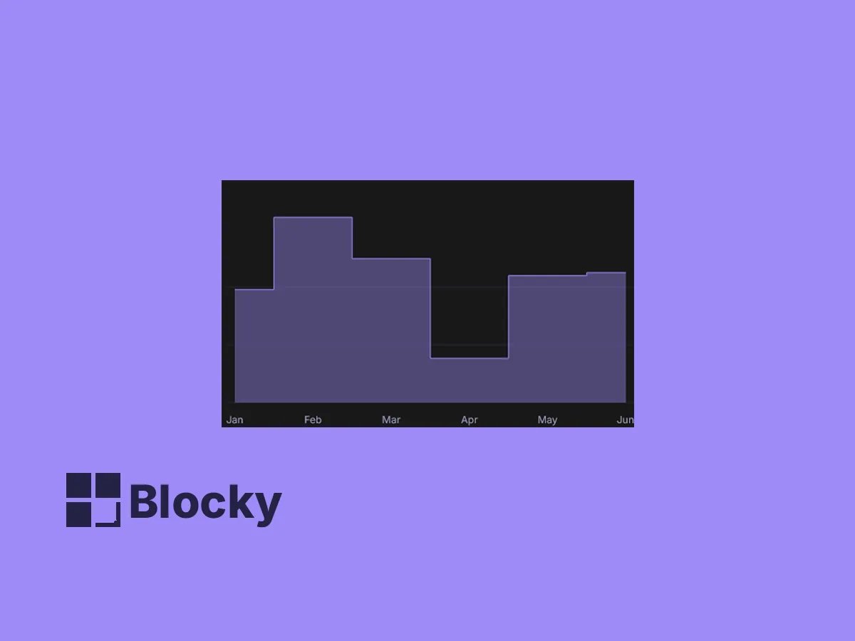
Step Area Chart
Highlight incremental changes or grouped data with this step-style area chart — great for discrete metrics.
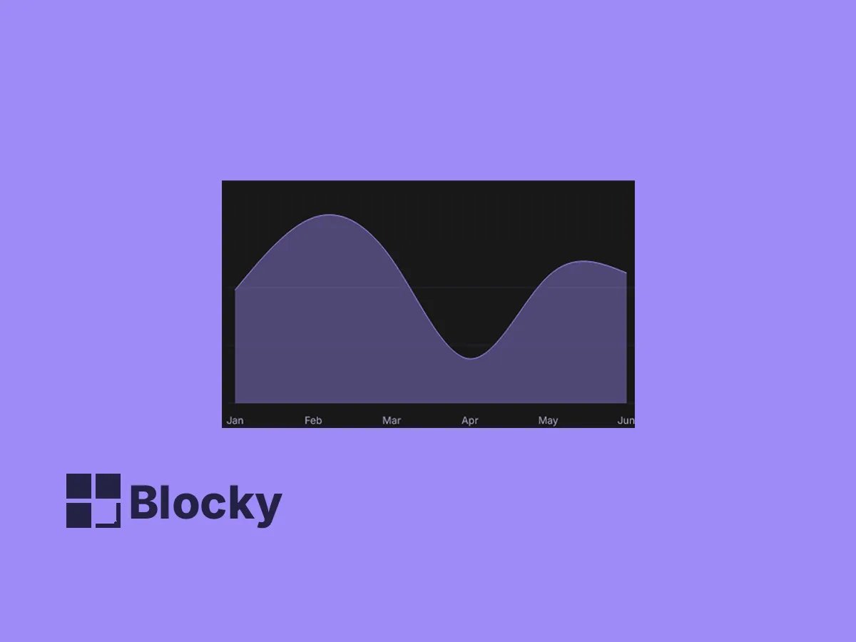
Natural Area Chart
A flowing, curve-based chart that adds a natural feel to your data — ideal for aesthetic dashboards in Notion.

Use Cases
Project Timelines
Visualize progress or trends over time by embedding area charts directly in your project pages.
Budget Monitoring
Track financial data like expenses vs income using area charts for clear insights.
Content Growth
Analyze content performance metrics like followers, posts, or views over time.
Multiple Chart Types
Linear & Monotone
Choose between different interpolation types for smoother or angular transitions.
Custom Axis & Opacity
Full Control
Configure opacity, axes, tick lines, and chart range for your ideal layout.
Minimal Visual Noise
Clean UI
Easily toggle off labels or axes to simplify presentation for Notion embeds.
Settings
| Setting Name | Section | Type |
|---|---|---|
| Show Legend | Legend | toggle |
| Min | Configure Chart Range | input |
| Max | Configure Chart Range | input |
| Type | General | select |
| Show Axes | General | toggle |
| Chart Opacity | General | slider |
| Tick Line | Axis Configuration | toggle |
| Axis Line | Axis Configuration | toggle |
| Format Label | Axis Configuration | input |
| Top | Margin | slider |
| Bottom | Margin | slider |
| Right | Margin | slider |
| Left | Margin | slider |
Embed Trend-Driven Visuals in Your Notion Page
Present clean, responsive area charts that help you and your team stay on top of what matters most.